Browsing Tag

Interior

Design & Lifestyle

Copenhagen on the Go; Danish Design

June 27, 2014

Sivan Askayo-copenhagen1-1

There is so much of the buzz related to Denmark and Copenhagen regarding the Modern Danish Design. Denmark has been a leading nation in the design field for decades. Whether it is a Danish furniture to Danish fashion and Danish toys, Denmark is producing World renowned design classics, which are being distributed and copied worldwide. Starting in the 1950s with design legends such as Arne Jacobsen (mostly known for the ‘Egg’ chair) and Hans Wegner (known for the ‘Shell’ chair) the Danish design tradition has developed into a strong international brand. Scandinavian, and in particular Danish design has become synonymous with timeless style and no wonder Copenhagen is filled with stores of that kind, and I will mention some of the names and addresses at the bottom of this post. Here are some of the spots we visited and these are really just the tip of the iceberg in Copenhagen.

DDC, The Danish Design Center

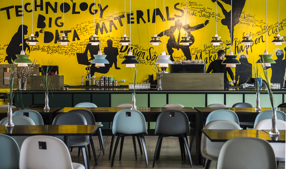
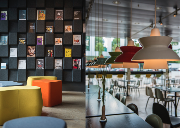
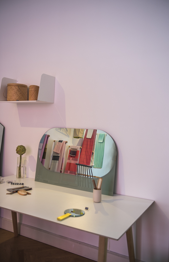
The Danish Design Center was different than what I had expected. Somewhat I thought I would find a large space which curates, shows and promotes the Danish design; a place that will play the role of a library or informational center, maybe even a museum of the history of the Danish design. Instead, I got into a nice and colorful cafe area, Design Society Cafe, where people can sit and work on their computers while the second floor is dedicated to some professionals whose goal is to promote the design activities in the intersection of design and innovation, in order to solve architectural problems. In other words, we didn’t see any kind of ‘design’ or furniture in the DDC, but we got to enjoy a nice coffee break in a very colorful space (see image on top).

Screen Shot 2014-08-23 at 3.28.38 PM

Design Society, Andersens Boulevard, 27. Opening Hours: 9:00- 17:00 during weekdays. The Danish Design Center 

Hay 

The first time I came across the colorful furniture and accessories of Hay, was actually last year during a shoot I had in Ghent (Flanders) where I ran into a beautiful concept store called Ydee, with a vibrant window-display . I had a nice conversation with the store owner who explained to me the philosophy of Hay. I could easily buy half of the store back then but I was ‘saved’ by a limitation of space in my small luggage. (I wish I could tell the store manager to pack me a table to go. You know what I mean). Since then I started to notice some mentioning of Hay on some of my colleagues blogs and I knew that once I visit Copenhagen, I definitely need to visit their store.

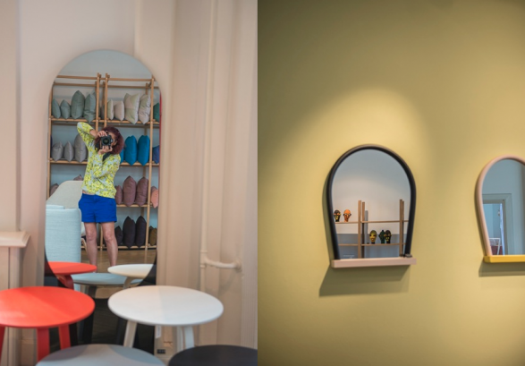
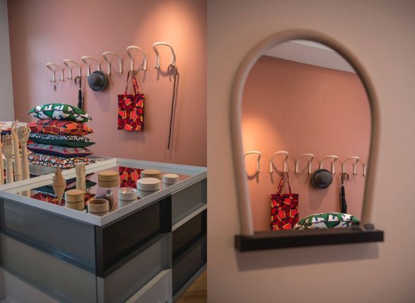
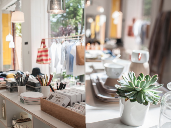
Hay is considered the forefront of Denmark’s design renaissance. The Hay House, is located in an elegant 1896 Art Nouveau building in Østergade 61 and it is a colorful two-floors store packed with brands such as Vitra, Alessi, Komplot and Established and Sons as well as many smaller local brands. When we got to the store, it was quite packed with other curious people like me who walked around and were happy to take pictures.

Screen Shot 2014-08-23 at 3.41.14 PM   Screen Shot 2014-08-19 at 10.53.44 PM

Sivan Askayo-Copenhagen-14

Hay, Østergade 61 Copenhagen.

Playtype

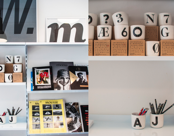
Are you in need for some fonts? Would you like to shop some? This tiny store in Værnedamsvej street is offering a very wide selection of fonts. In 2010, The Copenhagen design agency e-Types opened the world’s first physical font shop, serving as a material manifestation of the agency’s webpage. A few of my colleague bloggers recommended the place, which also sells posters, cups and T shirts, for the non graphic designers and/or the typographers among us. Those graphic designers and typographers will find a great interest on a Mac computer in the back, where they can search for fonts or buy one to take with them on a USB device. As this store is quite small, the easiest way to locate it in the city, is just across the street from Granola cafe. Check the opening hours in advance.  

Screen Shot 2014-08-23 at 3.54.58 PM

Playtype, Vaernedamsvej 6, Copenhagen, Opening Hours: Monday – Friday: 12-18, Saturday: 11-15

More Stores and Addresses worth checking:

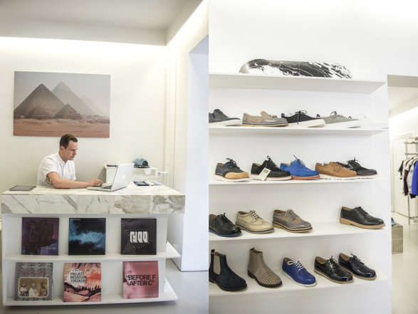
Norman: Located in a former cinema, this furniture store hosts the brand’s entire range of modern designs and also stocks larger pieces by companies such as New Danish Modern, Moooi and Established and Sons.

Designer Zoo: This is one of the most interesting places in Copenhagen to visit and witness how handicraft is being made. There are eight young in house designers with whom you can communicate and ask questions about their work flow, etc. From knitting, painting, metal work, glasswork or ceramics, the results are beautiful. The store was founded by Karsten Lauritsen, a furniture designer who was looking for a space to highlight these hand crafts from across Denmark in one place.

Royal Copenhagen: In case you are looking for a blue-blooded porcelain manufacturer (owned and run by the royal family from 1775 to 1868) then the Royal Copenhagen flagship in Amagertorv 6, is the place for you. Located in one of Copenhagen’s oldest renaissance buildings (dating back to 1616) the space is an integrated museum and shop, which stocks the brand’s entire collection, including the ‘Blue Fluted’ patterns that have graced Royal Copenhagen tableware since it was founded to modern collaborations.

Retrograd: For those of you who are after the Vintage, Retrograd keeps an impressive stock of vintage furnishings and household items from the 1950 and the 1960. It stocks everything from porcelain to tableware. The store was opened in 2003 first as a small basement store that soon got bigger. The store is considered a wonderland for any design collector, interior designer or anyone who loves to collect vintage items.

Screen Shot 2014-08-19 at 10.58.31 PM

Screen Shot 2014-08-19 at 10.57.08 PM

Design & Lifestyle

Semiramis Hotel; By Karim Rashid

June 4, 2014

Since I first came across the NHOW Hotel in Berlin, designed by Karim Rashid, I keep looking for more hotels and projects he designs. I was lucky enough to meet Karim a few times in person; Twice in New York, (both in his old and new studios) and once in Tel Aviv, where he is currently designing a new hotel, planned to be opened in October. While I am hoping and planning to shoot the next hotel in Tel Aviv, I had the opportunity to stay it one of the first hotels he designed. The Semiramis Hotel located in one of the most affluent and leafy suburb in Athens, called Kifissia. I wish I had more time to stay in Kifissia and at Semiramis but I was on my way to Milos for a shoot. It is such a magical area that one of my close friends described it: ‘If I ever want to disappear for a little bit, I can easily go to Kifissia’. 
I arrived at the hotel on a Sunday afternoon after a long flight from New York in which I didn’t really have the chance to sleep. Regardless, I was anxious to walk around the colorful hotel and discover some of Karim’s signature designs and style.

When the description of the hotel goes like this..“Semiramis is what happens when you give a hot designer total control”…I need to see it in my own eyes and cameras

So let’s start with the Pool:

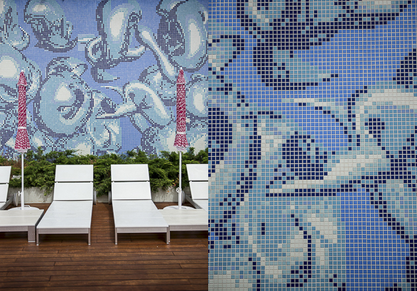
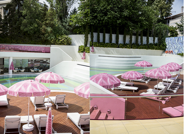
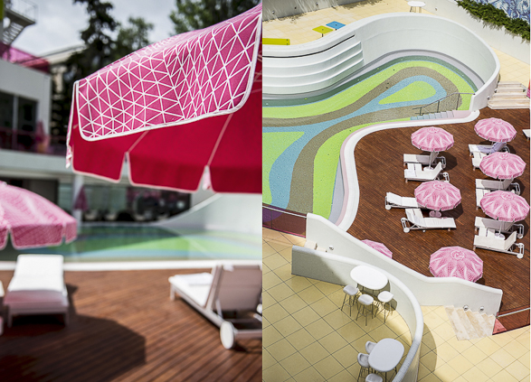
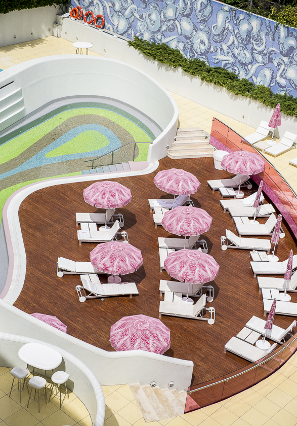
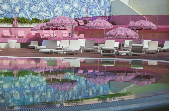
As a long time swimmer, I do tend to check out the swimming pools first when I check in to hotels. Even though the Semiramis pool is not a lap one, it was quite hard to ignore it. The pool is shaped in a fluid curved shape, typical to Karim Rashid’s style and colored in shades of turquoise and neon green. To complement Karim chose white sun-beds with pinkish color umbrellas, dotted with white. To be honest, I couldn’t stop taking pictures of this pool. I tried to cover every angle. A mosaic dark blue fountain adds a decadent touch and border between the pool area and the area around the hotel.

The Facade:

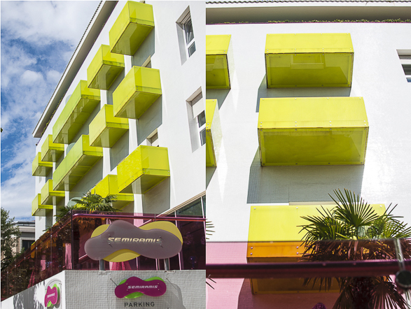
Only by seeing the colors of the Sun terraces (Lime Green) I knew I arrived at one of Karim’s playgrounds. The facade is totally different to the Greek typical style, and this is what I actually love about Karim’s style. His designs are ALWAYS extraordinary. To enter the lobby I had to walk through a glowing pink glass cube and to be warmly welcomed by one of the staff, offering me a glass of sparkling water.

The YES Lobby:

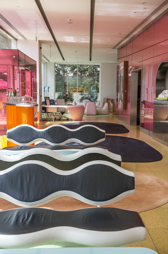
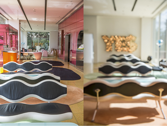
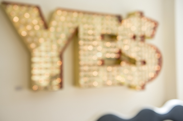
As Semiramis is part of the YES! Hotels group, the Artwork ‘YES’ by Tim Noble and Sue Webster is definitely a great visual welcoming sign. The affirmative “YE$” sign presents the familiar dollar symbol in a bright display of shimmering lights flickering on and off before the viewer. I enjoyed watching this sign when I got back to Semiramis after an evening stroll in Kifissia. On a bright Pink wall the Artwork ‘VBGDW’ by Vanessa Beecroft is also a welcoming gesture. ‘VBGDW’ is a photo of Vanessa Beecroft’s wedding party in Portofino in September 2000. (Rumors say she is divorced now). The dark blue Wavelength Sofas designed by Karim, gave me a feeling as being under waves in the ocean.

The Bar and Dining Area: 

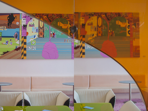
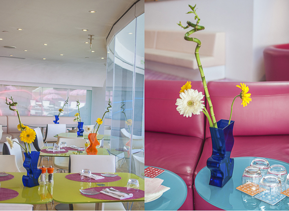
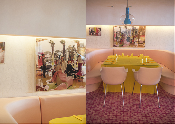
I just LOVE this bar and dining area. I felt as I was walking in one of the wings of a contemporary modern museum. And no wonder. Dakis Joannou, the hardworking owner of Yes! Hotels, is one of the foremost collectors of contemporary European art in Greece, and therefore is surrounding himself with objects that inspire him, from Art, Design and Architecture. I could spot two Artworks by Spencer Tunick, (The ‘New Vienna’ and ‘Krystl’) and the ‘Shutup’ Artwork by Michael Bevilacqua right above the seating area. On a Pink color carpet, Karim furnished the dining area with his signature Swing Chairs in addition to a lively lighting concept, especially commissioned from Focus Lighting in New York, under the direction of principal designer Paul Gregory. I love the Orange colored glass wall, which made a perfect dividing wall between the Bar and the Dining area. Unfortunately, I couldn’t really dine at Semiramis restaurant, as it was closed due to a private event. Well, it is a reason for me to go back…

Rooms:

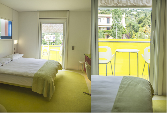
Semiramis has three types of rooms; Standard rooms, 20 meters squared rooms overlooking the park of Kefalari. Queen bed and above bed- lighted murals offers a pop of color to the all-white feeling of tranquility of the room. The Superior rooms, 25 meters squared are overlooking either to the park or the great pool. (I was lucky enough to overlook the beautiful pool) and then there are The Pool Bungalows, 25 square meters, built as separate units alongside the pool and each bungalow has a King size bed  and a private small garden. I have stayed in one of the Superiors rooms overlooking the pool. I loved having a great afternoon light reflecting and glittering on my lime green terrace and watching the sunset over the hills around Kifissia. The hotel has its own sense of humor, which reflects well in the design; The rooms, for instance, don’t have numbers, but every floor has a color and each room has an icon. To find my room, I had to spot the icon across the hallway. Instead of the typical boring ‘Do Not Disturb’ signs, hanging on the door knobs, Karim decided to place electronic message boards at every room entrance, which guests can personalize from their in-room keyboards.

I’m really looking forward to see the next hotel designed by Karim Rashid, Sir Benjamin Hotel, coming soon in Tel Aviv.


Design & Lifestyle Editorials

Karim Rashid in Style Magazine, Israel

July 12, 2013

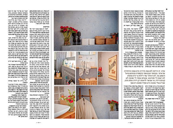
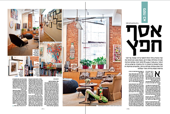
I think almost every photographer and writer gets curious to find how their article will come out on print. Speaking for myself, I’m always eager to know how the editor will transfer my thoughts, words and images to the readers. I met Karim Rashid in the beginning of June and interviewed him both for my blog and for Style (Signon) Magazine in Israel. You can read more about how I met Karim or how did he find me here.

This is my interview with Karim, translated to Hebrew and published in Style magazine, Israel.

Design & Lifestyle

Nhow Hotel Berlin; by Karim Rashid

May 25, 2013

Nhow Hotel, Karim Rashid, Berlin, Design, Interior

I have always wanted to know what does Karim Rashid eat for breakfast, mostly because I am curious what feeds his brain and where does he get all his inspiration and creativity from. Not once did I pass through his office space on 17th street in Meat Packing District in New York, but I never had the courage to get inside and ask. I have seen his website, I read articles about him but nothing prepared me to see his creations in real, moreover, a big one, such as a hotel. I have heard about Nhow Hotel Berlin only three days before my visit to Berlin and I knew I had to see it and shoot its interiors if possible when I’m there.

Nhow Hotel Berlin is known and nicknamed as The Music and Lifestyle Hotel, mostly because it is the only hotel in Europe that offers two professional music studios, well equipped with recording booth, mixing and pre and post-production options. Therefore, among the guests you can find business travelling cosmopolitans, international jetsetters, night owls and the hottest bands who stay at the hotel both for the love of music and for the great experience the hotel can offer. I didn’t have the chance to peep into these studios but for other public spaces I did.

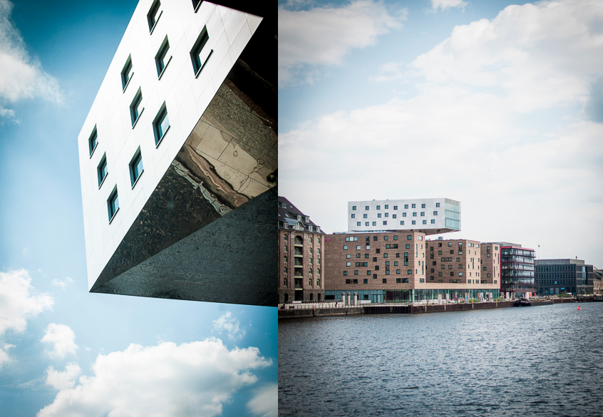
The hotel is located on the banks of the Spree river in between two of Berlin’s coolest districts; Friedrichshain and Kreuzberg, and has three towers. The East and West Towers on the side of the building and the upper tower which extends beyond 21 metres out of the building over the Riverbank. This silver colored tower serves as a reminder of the former city harbour area on the bank of the river.

Berlin, Nhow Hotel, Interior, Karim Rashid, Germany

If you have the opportunity to stay at Nhow Hotel when you are visiting Berlin, just grab that opportunity. If not, keep reading my post and enjoy the pictures and the visual tour.

The Breakfast Room:

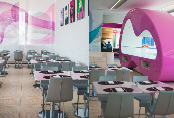
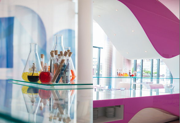
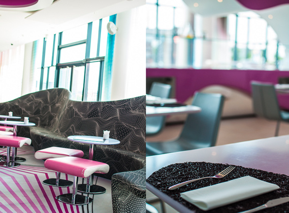
By the time I got into the breakfast room, the food was already taken from the pink bubbly table display. All I could find were colorful membranes that served as decoration probably. The tables and chairs are funcional grey color and a pop art posters of celebrities such as Johnny Depp and Mother Teresa next to each other are on the dining room’s walls. I’m sure breakfast time is quite interesting there.

Nhow Hotel, Karim Rashid, Berlin, Design, Interior

Nhow Hotel, Karim Rashid, Berlin, Design, Interior

Nhow Hotel, Karim Rashid, Berlin, Design, Interior

Fabrics Restaurant: 

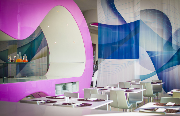
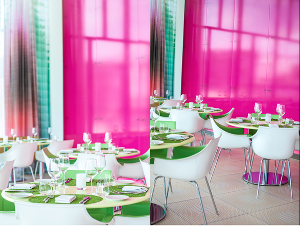
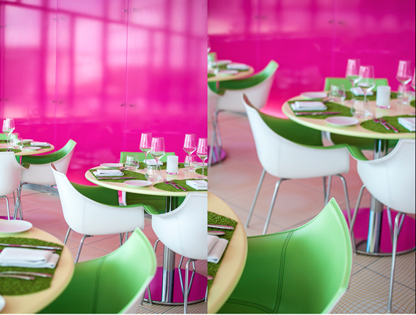
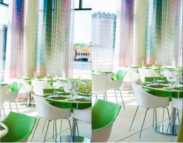
Just next to the breakfast dining room on the ground floor, separated by a light white curtain, Fabrics restaurant is a blast of colors and a feast not only to the palate but also to the eyes. The color combination of pink fuchsia and minty – neon green is a winner. The restaurant is situated in a corner with glass exterior walls and offers a magnificent view of the Spree River and the Oberbaum bridge. But not only the color combo is a winner. Also the food and the masterpiece dishes that seem to follow a similar color scheme. The head Chef Patrick Rexhausen is creating a new menu every six weeks, based on German-French cuisine. The restaurant is opened for breakfast, lunch and dinner. (Menu can be found here).

Nhow Hotel, Karim Rashid, Berlin, Design, Interior

Nhow Hotel, Karim Rashid, Berlin, Design, Interior

Nhow Hotel, Karim Rashid, Berlin, Design, Interior

The Envy Bar and Lounge: 

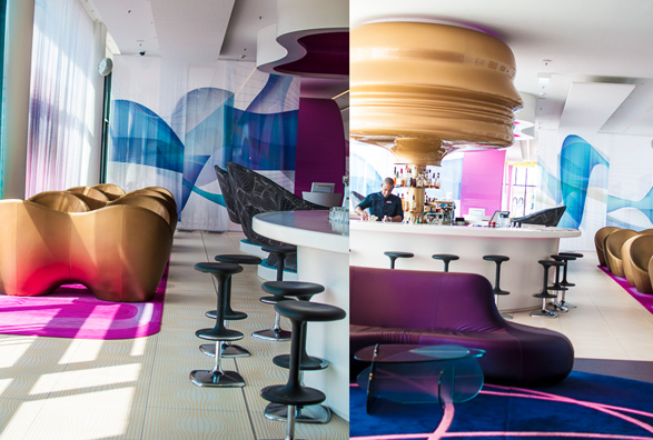
Imagine a giant golden face hanging over the barman, and matching the golden chairs…Imagine drinking a colorful cocktail, based on sake and tequila, developed by one of Germany’s best bartender, Christina Schneider. Imagine 100 gold, pink, purple and black seats that allow you to dive into comfort, while overlooking the Spree river and sipping a ginger lemonade. This, and more, one can find at the Envy Bar. (No wonder they called it ‘Envy’).

Nhow Hotel, Karim Rashid, Berlin, Design, Interior

Nhow Hotel, Karim Rashid, Berlin, Design, Interior

The Lounge: 

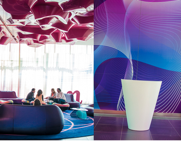
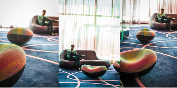
The lounge is just right after you pass the reception. On a blue rug with pink strips, you can either have a drink, rest a bit or just lounge on colorful psychedelic cushions. The big windows are over looking the river and wash the lounge with bright light. The ceiling is dotted with pink plastic tubes.

Nhow Hotel, Karim Rashid, Berlin, Design, Interior

The Elevators:

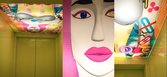
Taking the elevators has never been so enjoyable and fascinating. Each elevator is in a different color and when you look up, there is always an interesting painting to look at. It reminded me a bit a scene of Pedro Almodóvar‘s movie, probably for the a-symmetric figure.

Nhow Hotel, Karim Rashid, Berlin, Design, Interior

and once I took the elevator to the rooms and the door was opened, all I could see was that!

Nhow Hotel, Karim Rashid, Berlin, Design, Interior

The Rooms: 

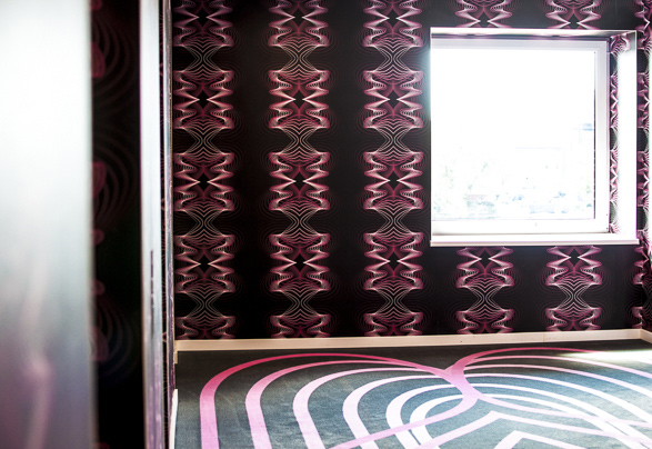
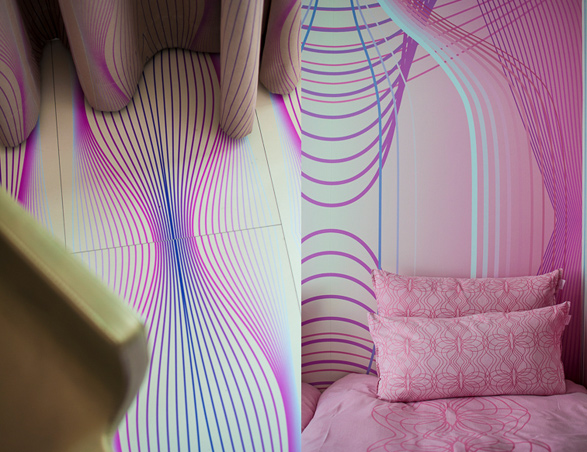
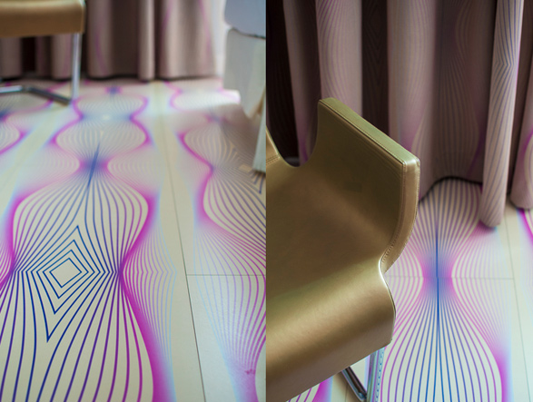
I wish I could see most of the rooms in the hotel as I have no doubt they don’t look the same. However, the 304 rooms are divided into three -room categories; Standard rooms, superior rooms and junior suites. What makes the rooms unique is the option to choose between three color schemes; Pink, Blue, Pink/Black or Blue/Black all depends on the rooms’ location. Rashid thought about every little detail and it seems that everything is synchronized and working perfectly; The wall papers go along with the floor papers that work well with the beddings and the curtains. All look like a great visual symphony. Every room has wireless connection and well equipped for PC, Mac, and iPads. The bathroom is separated from the bedroom with a shocking pink glass and I’m sure it offers a great experience.

Nhow Hotel, Karim Rashid, Berlin, Design, Interior

Nhow Hotel, Karim Rashid, Berlin, Design, Interior

Karim Rashid is, by far, one of the most creative designers in the world. The short visit in Nhow Hotel definitely left me curious to see more of the other locations he designed and created. Stay tuned for more.

Design & Lifestyle

Palacio Belmonte in Design Sponge

July 9, 2012

Design Sponge, Palacio Belmonte, Lisbon, portugal, Design, Lifestyle

I’m really honored and excited my images of Palacio Belmonte in Lisbon were warmly welcomed by Amy and Grace from Design Sponge. I had a good feeling they would love the interiors, the colors and more over, the great story behind the Palace and its furnitures, and would love to share this magical place with their readers.

I love how Amy described the circumstances and coincidence that led me to discovered Palacio Belmonte and become friends with Fredric, the owner.

‘This June, she was in Lisbon, on the hunt for the two most important things for a modern traveler: a bathroom and a WiFi connection. She stumbled into the Belmont Coffee Club, and while checking her email, she chatted with the friendly staff and the cafe owner, Frederic Coustols. One thing led to another, and Sivan found herself touring the Palacio Belmonte. Lucky for us, she brought her camera’ .

To see more of my features in Design Sponge, please click here.

Thank You Amy and Grace!

Design & Lifestyle Editorials

At Magazine May Issue

May 22, 2012

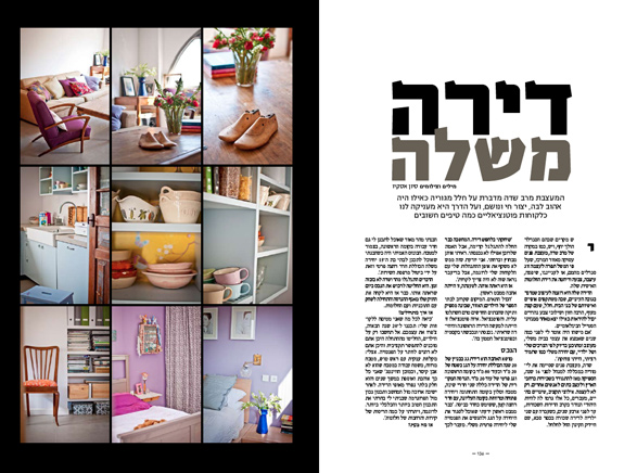
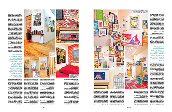
A photographed interview with a talented interior designer and a good friend Merav Sade is now published in At Magazine, May issue. Merav is talking about the process of re-modeling and styling her own private apartment and she is giving few essential tips for readers about interior design. I just love the way she chose the colors and all her vintage furniture! Definitely a keeper.

interior, lifestyle, tel aviv, merav sade

interior, lifestyle, tel aviv, merav sade